Website and logo redesign
MetricLab
User Research Bay Area
Rebranding a User Research firm
Problems
MetricLab was starting to have identity problems. One half of the problem was that clients weren’t clear about what they did. The other half of the problem was that they didn’t look as cutting-edge as they said they were.
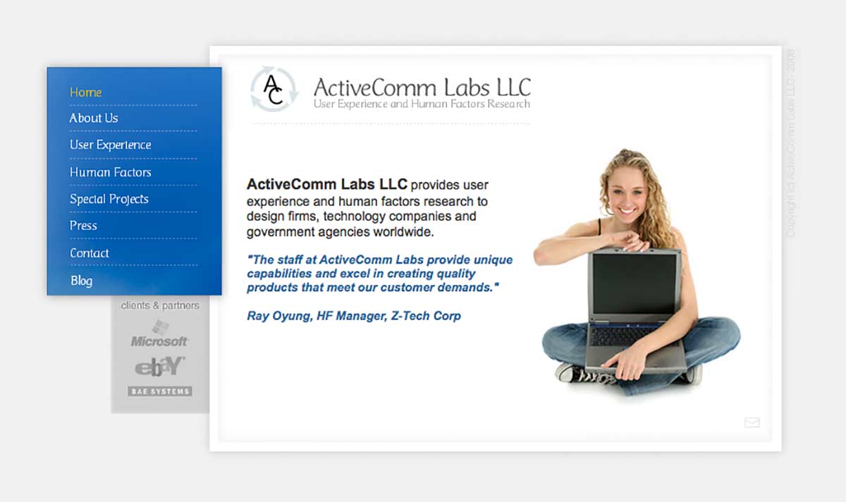
As you can see below, their old site was quite stale. Their website and identity were stuck back in the days when we used to call the internet “cyber space.” The value that they offered was not being refelcted in their identity nor their website.
You know the deal—time for a redesign.
“We need a complete make over”
Rebrand
We came up with a new name, logo and website. Most beginnings are humble—so are the designs that accompany them. It’s important to get in the game with your best foot forward. However, with success, it’s important to keep your identity in line with your growth. MetricLab had grown substantially since they opened. It was time to level up and match their identity to their high quality services.
New name
We changed the name to MeticLab. The old name, ActiveCommLabs LLC suffered in many ways. First off, it wasn’t memorable. Second, it was very generic sounding. Thrid, the LLC part made their business sound like a law firm. So we chose a suggestive naming style to keep their name aligned with what they did, but with a much stronger name.
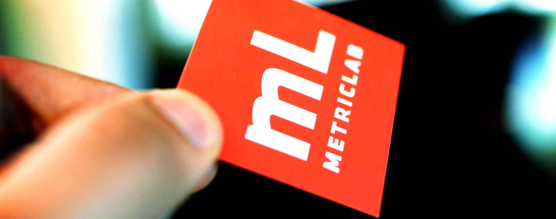
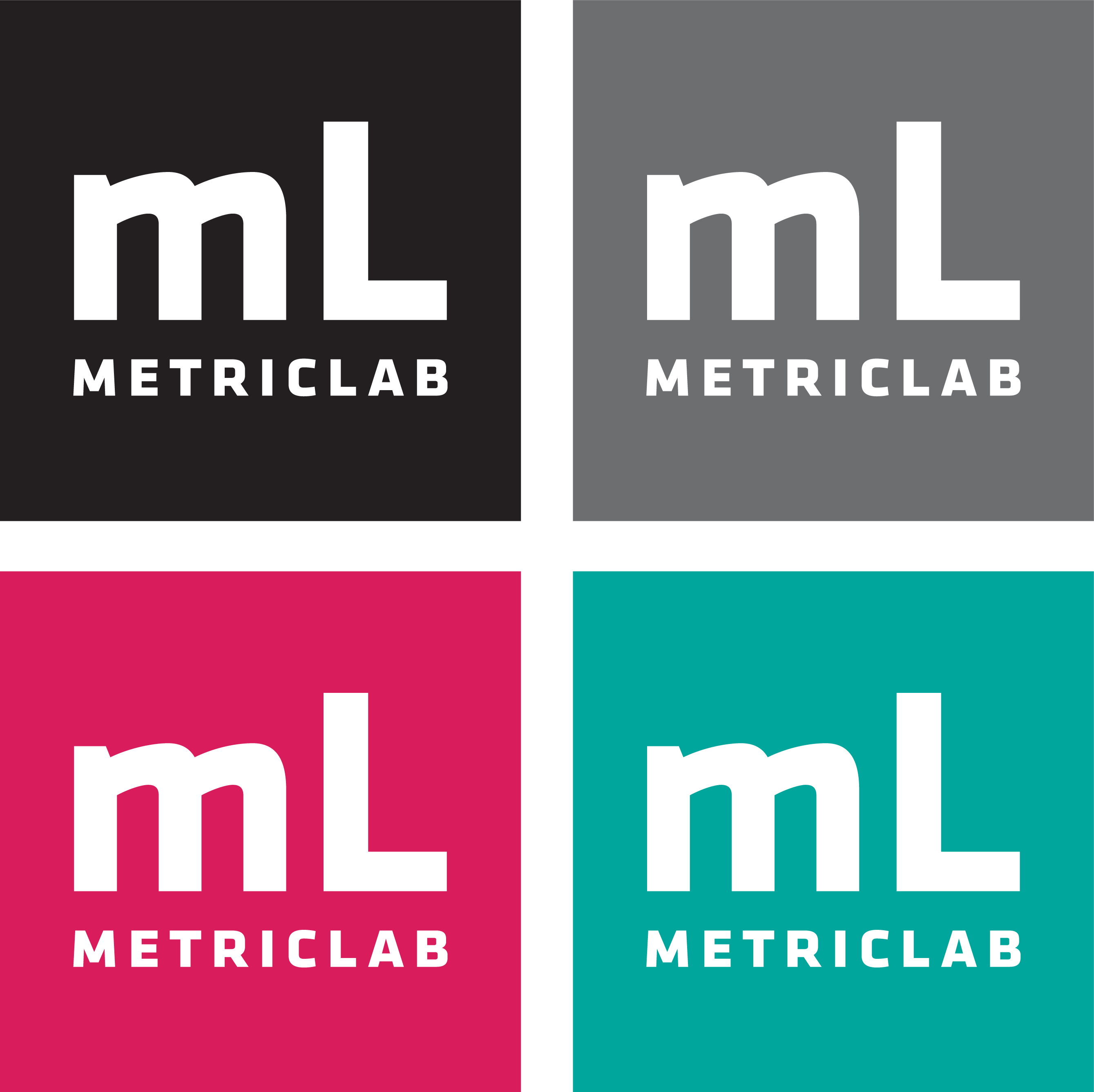
New logo
We redesigned the logo. The old logo had a lot of bad things going for it. First, it’s design was sending conflicting messages. The circle with arrows was sending a message that implied recycling, which they didn’t do. Next, the AC monogram looked like something you’d see on towels at your grandparents house. It was a style of lettering that rooted them in looking old instead of new.
We created a better logo by using a square shape to relate it visually to a unit of measurement. Also, a square is a stable and timeless shape. A square doesn’t look old or new. It just looks stable and balanced. The mL and layout borrows an appearance similar to the periodic table, and that’s the point. We wanted to employ all the tricks in the book to align their identity with being scientific, analytical and percise.
New website
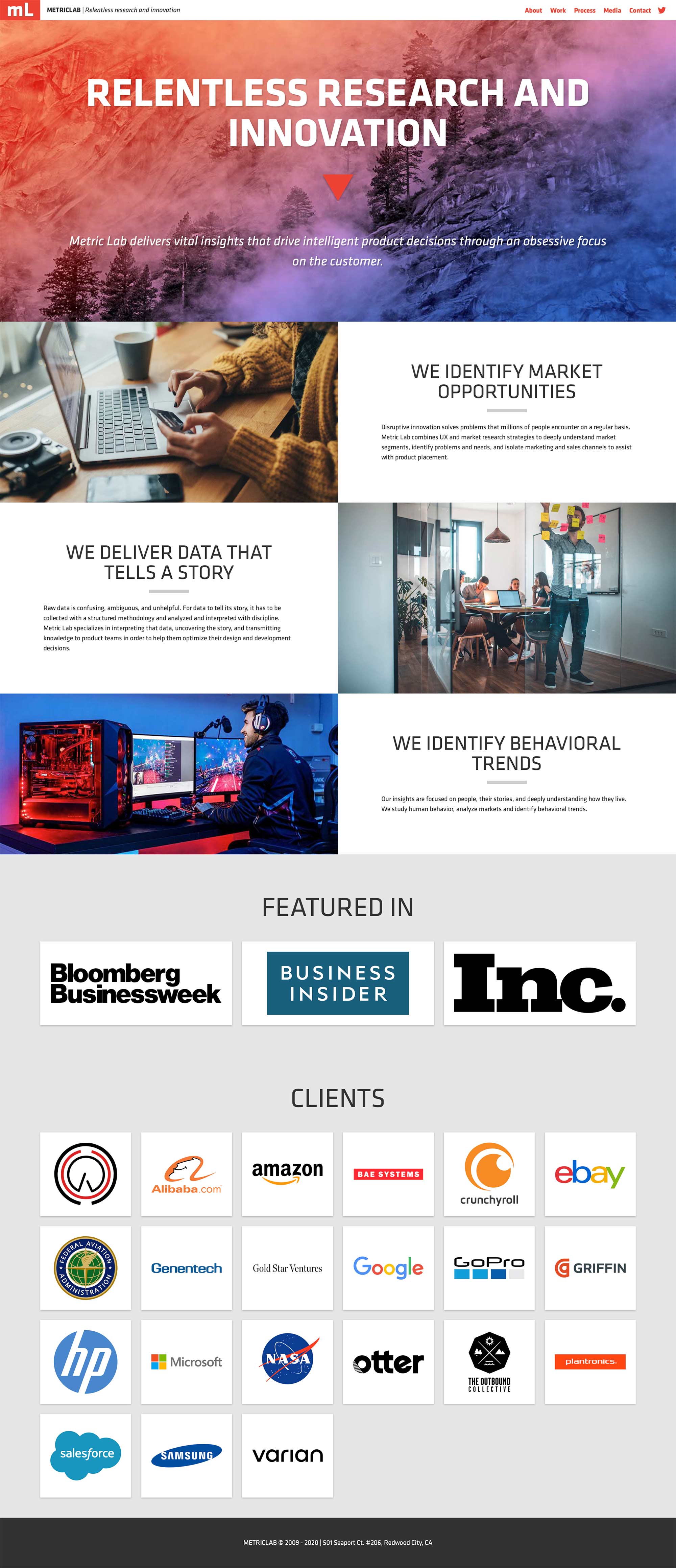
We designed and developed a brand new website. The old website had bad design, layout and imagery. The image of the girl with the laptop was bad, but the fact that the laptop screen wasn’t even turned on made the image even more painful. We wanted the new website to fix all of these problems.
We wanted the new website to take it’s time to introduce itself to the viewer. We started with a strong and clear statement about what they did, “Relentless Research and Innovation.” We then took the time to slowly intoduce what they did, and we ended on a strong client list to reinforce their authority and experience in the field.
Nerdy
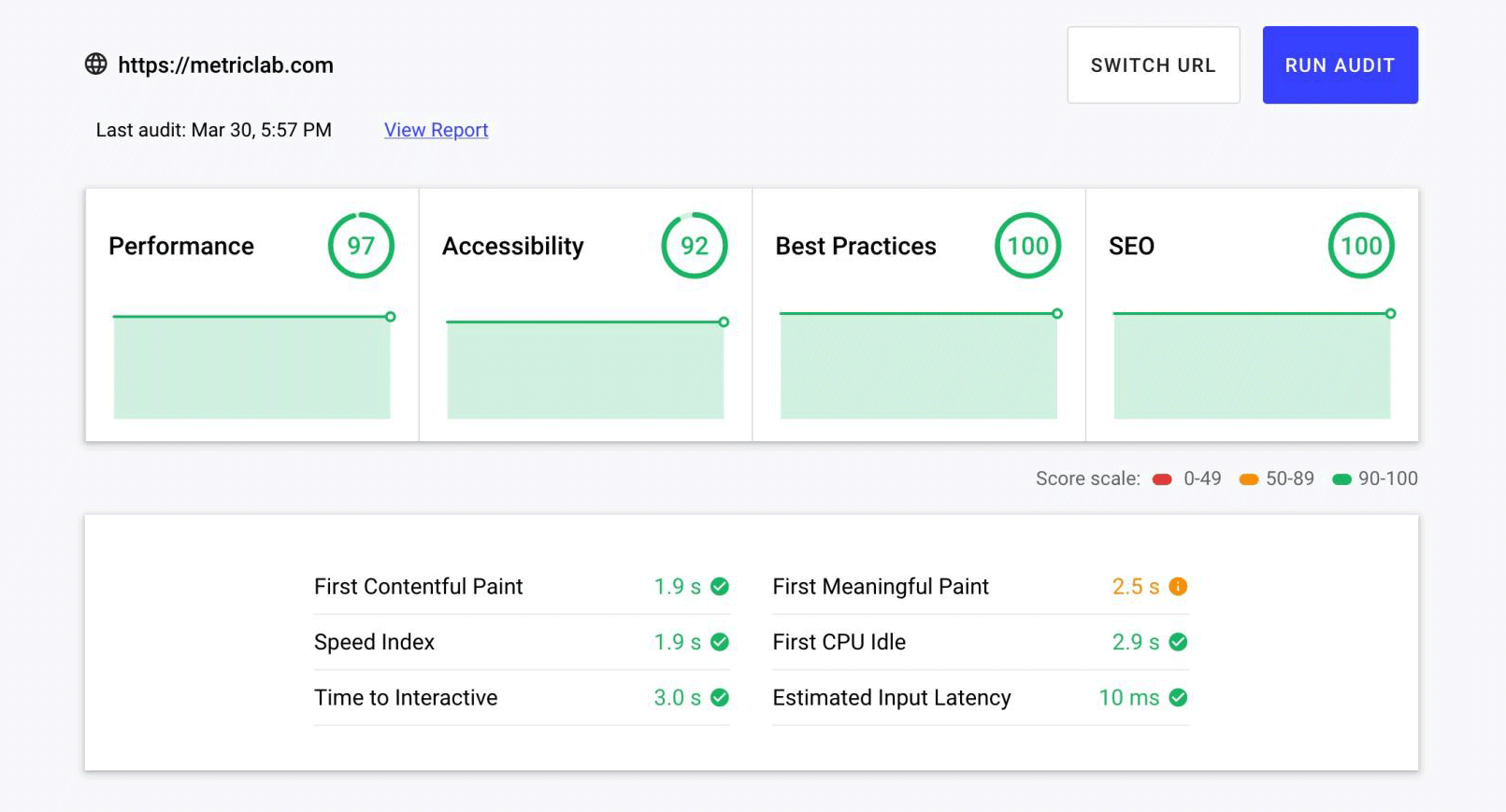
We had a lot of nerdy goals to accomplish as well. MetricLab wanted their site to load fast and to be a secure as possible. To accomplis this, we traded in WordPress for Hugo. WordPress, although popular, is notoriously slow to load and happens to be the most hacked content management system in the world . We instead opted for Hugo, which is insanely fast and secure. This eanbled us to focus on speed and security while delivering a platform that MetricLab could manage on their own.
Outtro